Website / Visual identity
Birth Sister Elisa
A warm, editorial digital identity for a birth and postpartum doula serving families across West and Central Virginia.
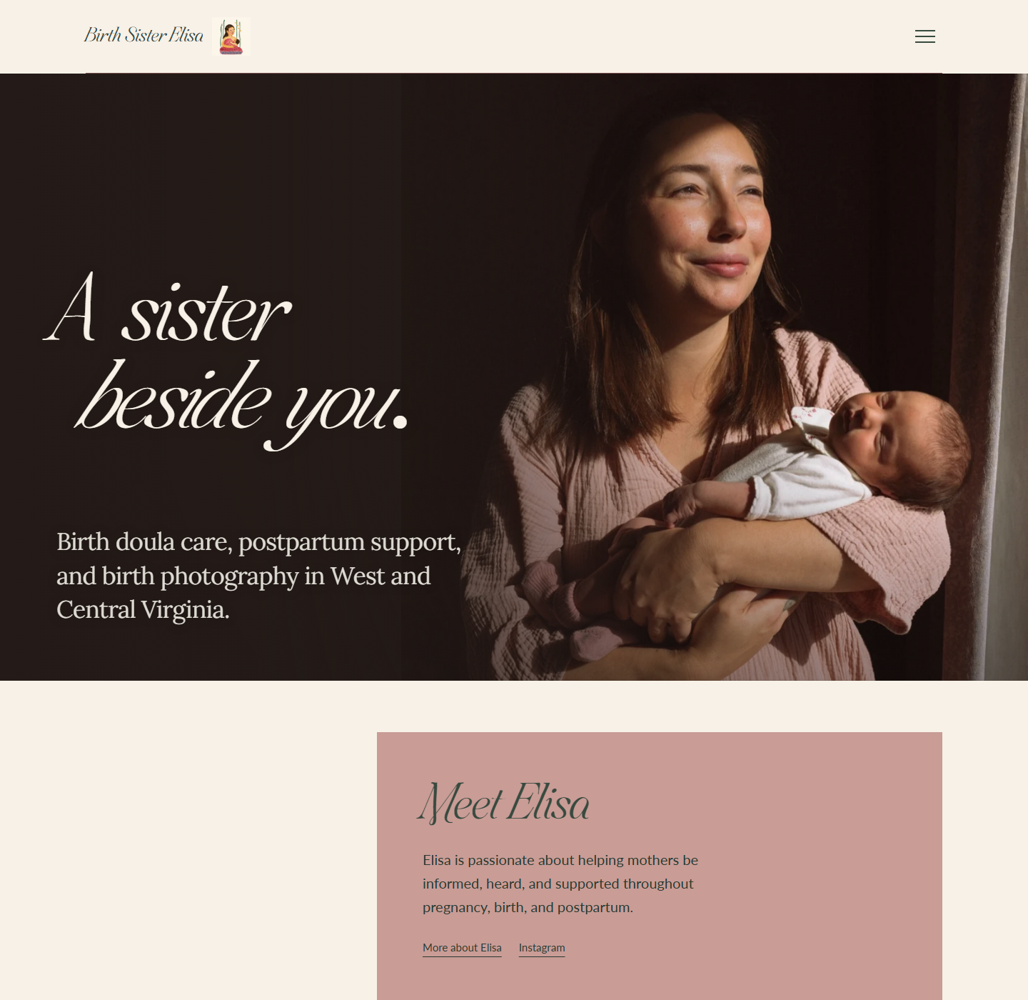
WEBSITE DESIGNRESPONSIVE + INTERIOR LAYOUTS
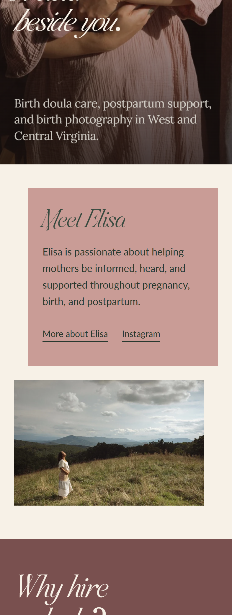
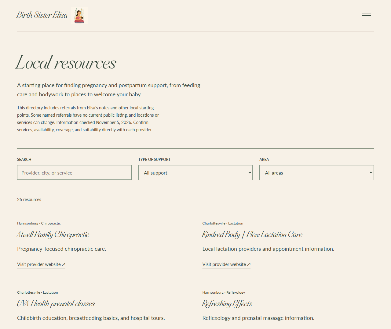
BIRTH SISTER ELISAWEB + VISUAL IDENTITY
THE VISUAL DIRECTION
A sister beside you.
Comforting, human, and personal. An editorial identity built around softness, trust, and the experience of being supported.
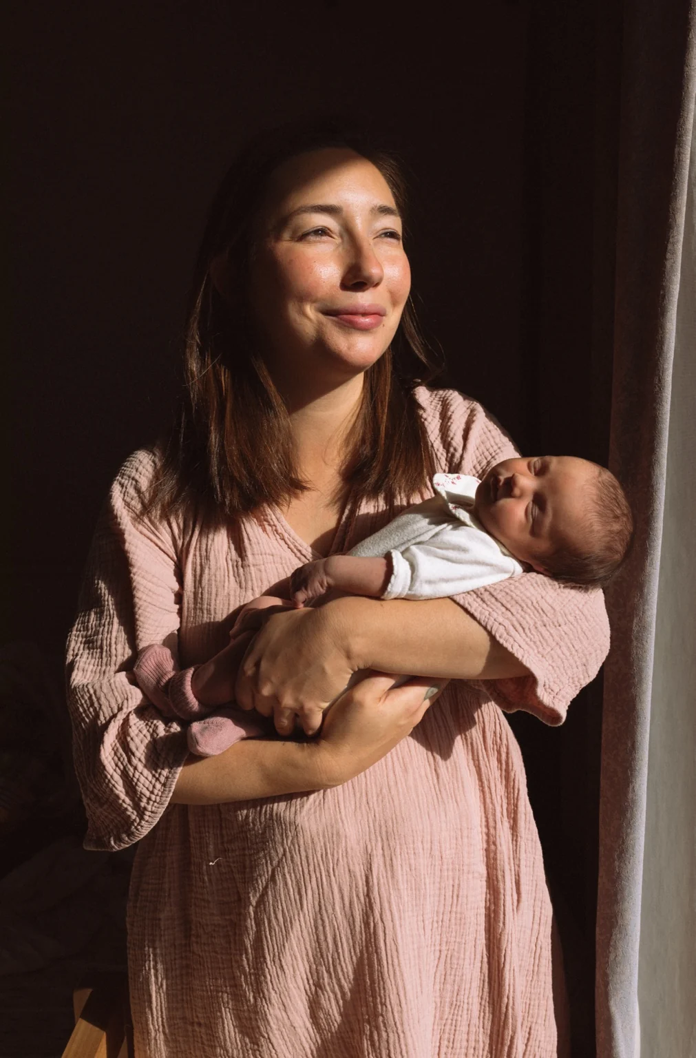
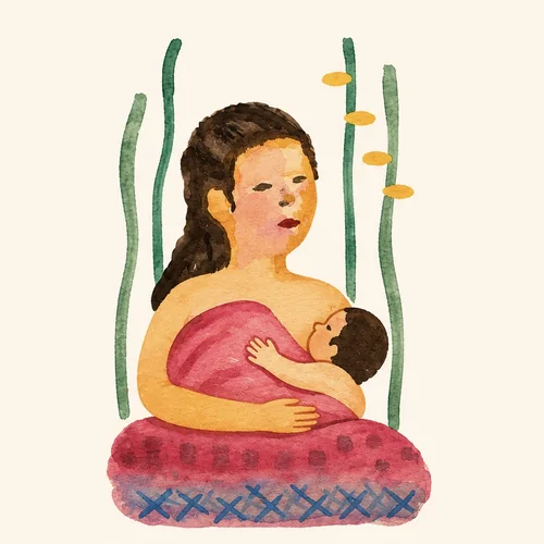 ILLUSTRATED LOGO + DESIGN PRINCIPLES
Warmth
Gentle color and natural photography.
Clarity
Easy-to-find services and contact information.
Trust
Personal presentation and inviting language.
COLOR STORYIDENTITY PALETTE
Soft sage#B9C3AF
Deep sage#384A3F
Dusty rose#C99C96
Deep rose#79504F
Cream#F7F1E7
TYPOGRAPHYDISPLAY + BODY
SWEETFORM SERIF / DISPLAYGentle by
design.
design.
Editorial contrast and elegant italic forms.
LATO / BODY + NAVIGATIONThoughtful care and clear information.
Legible supporting type, with Lora used for selected editorial copy.
WEBSITE DETAILSIMAGE + INFORMATION

Website design concept featuring a full-bleed photographic opening, editorial typography, and carefully organized information. Presented as a design case study prior to the site’s official launch.