SHENANDOAH WEB STUDIOIDENTITY STUDY / 2026
BRAND DIRECTION
Made for the
place we call home.
A local visual language built around familiarity, usefulness, and the landscapes and traditions of the Shenandoah Valley.
COLOR SYSTEMWEBSITE PALETTE
Warm paper#F3EFE5
Deep ink#172B24
Evergreen#24483B
Terracotta#A64F3D
Harvest gold#D4A45C
TYPE SYSTEMTYPE CHOICES ON THE LIVE SITE
DISPLAY / GEORGIAGood things
grow here.
grow here.
Classic, approachable serif forms for a familiar editorial voice.
BODY + INTERFACE / ARIALAa Bb Cc 012345
Plainspoken, readable supporting text and navigation.
ART DIRECTIONLOCAL CHARACTER, DIGITAL CLARITY
Familiar
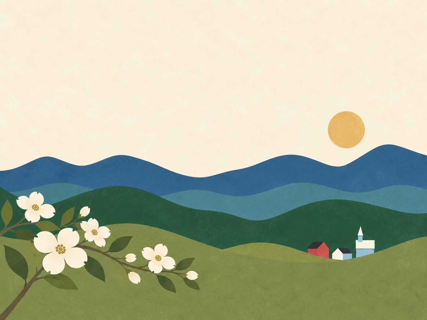
Quilt geometry and regional scenery create a recognizable sense of place.
Clear
Readable type, direct messaging, and uncomplicated navigation make the site useful.
Welcoming
Soft neutrals and grounded colors feel neighborly rather than corporate.